Sage Rebrand
My team worked with our brand agency of record, Wolff-Olins, to create a new brand architecture. The visual identity was born from a signature gesture, the ‘Sage Flow’, which positioned us at the heart of everything a business does. The rebrand was a corporate-wide effort that spanned my global team working hand-in-hand with different Sage functional groups, including marketing, design, product and communications.
The ‘Sage Flow’ inspired the rest of the identity, embodying a state of perpetual forward progress.
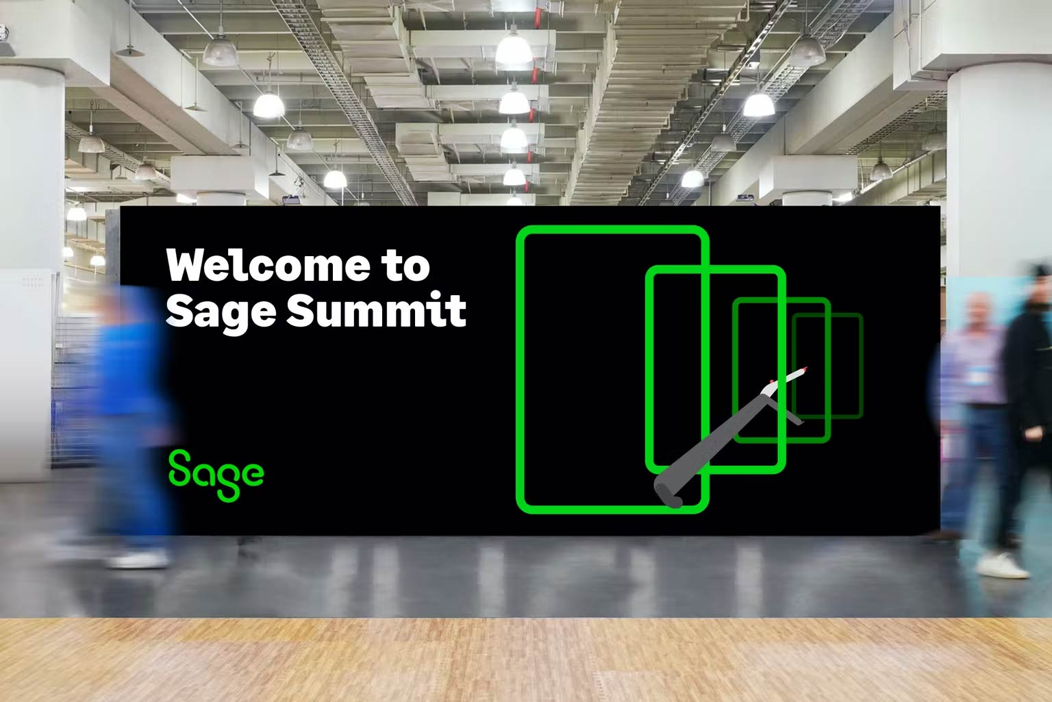
The new brand provided flexibility across communications, products and events.
Animations brought new life to key elements of our business.
The UI/UX design approach injected personality into our numbers-driven brand.
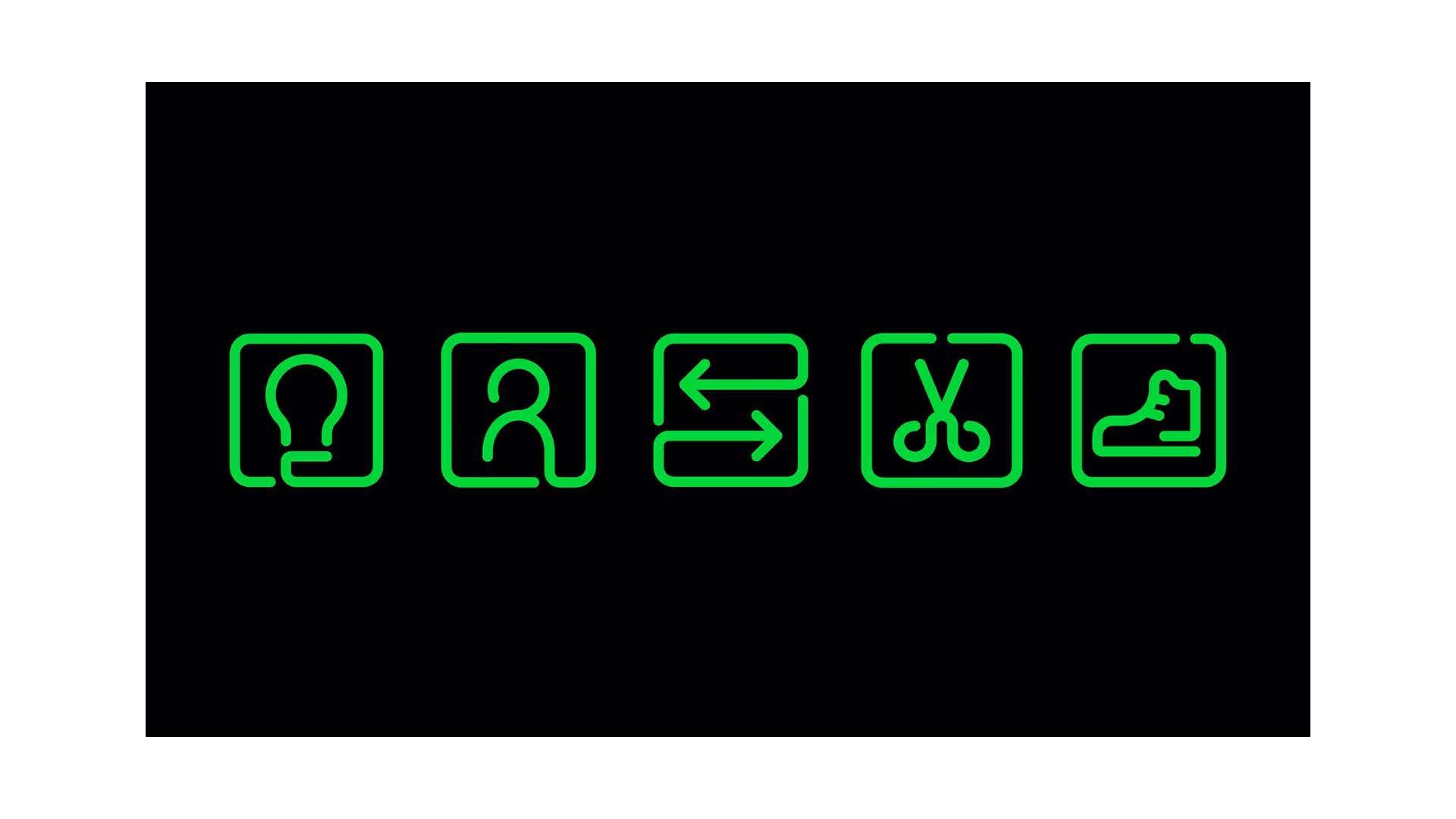
The iconography, custom illustrations, and warm gestures connect everything together.
Movement was a must have, as we’d been a static brand for too long.
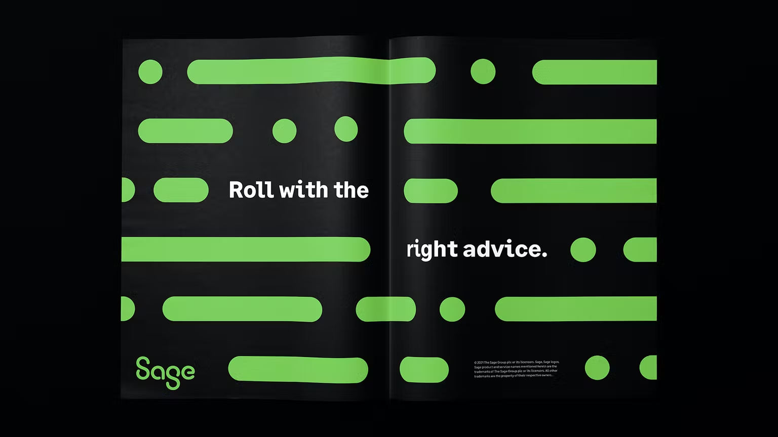
Dashes and dots provided a graphical element that supported typography.


